Free shipping on qualifying domestic orders over $50
Labyrinth + Cards = aMAZEing art with Kirsten
August 24, 2016
Shhhhh, you hear that? No? That's okay because it's silence. At my house. The first day of school was this week and it was awesome (Yippee!!!!). All four of my darling daughters are in school now and for the next 6 weeks I will thoroughly enjoy all the silence before I return to school and begin teaching art again. One of the perks, I guess, at my school is the "specials" classes don't start right away so I have more time to prepare! And procrastinate!
While I was enjoying the silence and procrastinating my lesson planning I played with the new Labyrinth Series stencils from Artistcellar. These stencils are ah-may-zing and I have only tipped the iceberg on the creative possibilities!
I ended up creating four different greeting card designs and I am pleased with how unique they are from each other. My substrates are blank white smooth greeting cards by Strathmore. I found them in the depths of my stash. When using a supply (like these gorgeous stencils) for the first time I usually like to work with a smaller size paper and what's better than a blank greeting card!? That way, if I make something AWESOME, I can send it to someone and bring a little sunshine in their mailbox. Who doesn't love that?
Here is a list of the supplies I used and a peek into the process:
- Blank Greeting cards
- Random Painted Papers from my stash
- Dina Wakley acrylic paints and gesso
- Distress Crayons
- Inka Gold
- Viva Pearl pen in Ice White and Black
- DecoArt Media Liquid Glass
- DecoArt Media Crackle Paste
- Black pen
- Acrylic Glazing Medium
- Faber Castell Pitt pen in Gold
- Artistcellar Labyrinth Series Stencils
CARD #1
Using a random piece of painted deli paper from my stash I pasted it to the front of my card. (Use a clean brayer to really smooth it down!)

I chose the Crete stencil for this one and started with a layer of gesso and then I bumped the stencil over a smidge and did a layer of red. When that was all dry I put the stencil down again and traced all those lovely lines with a black pen. I just dig that off register look it makes.
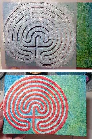
It still needs text and I haven't decided yet what I want it to say. Suggestions welcome!(That stencil does look a bit like a brain here, don't you think? hahaha!)

CARD #2
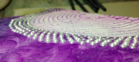
This time I used the Chartres stencil with the crackle paste. I applied the paste in a thin layer with a palette knife. Be still my texture-lovin' heart! I was unsure how successful it would be since the lines in this stencil are smaller but the result was gorgeous!

After the crackle paste was fully dry because you don't want to ruin that lovely texture I applied a wash of Blackberry Violet and Night. Before it dried I gently wiped the paint from the crackle paste and then added a painterly layer of the same colors beneath it.

For the finishing touch I applied five lines of pearl dots with the Ice White Perle Pen. (You can make a big impact by repeating a simple element.)

I think of this card as a love letter to Texture. (Texture, how I love thee, Let me count the ways....) Just check out those little pearls!
CARD #3
(Let me start by saying that this card is not my favorite. I almost decided not to include it but the simple technique I used is so fun and wanted to share just in case it is new to you.)
Up next is the Gonzaga stencil! I grabbed Dina Wakley's brand of Gesso and applied it with a palette knife making sure not to smooth it too much because I wanted the texture (of course!).
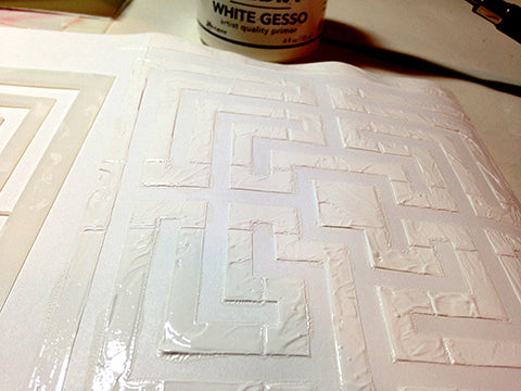
When that was dry I grabbed a cosmetic sponge to apply some Ruby and Tangerine colors to the entire card. Then, with a baby wipe or lightly damp cloth, I wiped the paint from the gesso. (Dina's gesso is less matte than others I have used and it lends itself to this technique making the paint wipe easily from the surface.)

Now this is when things got a bit wonky. I grabbed my black pen and traced the design to make the maze stand out more. It was then it reminded me of Pac Man or other maze games. I used the Black Pearl Pen to make some shiny dots and then added some words in the center.

While I like the idea I think my execution was a bit messy. I also don't like my lettering. Sometimes hand lettering works and other times it doesn't. I'm going to type up my words, print it and glue it over my lettering. I think I will be happier with it then. Yay for creative solutions!!
CARD #4 (My favorite!!)
This one started with Distress Crayons. So smooth! So colorful! Don't be stingy with the color.
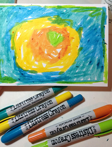
The crayons are water activated but instead of water I used Acrylic Glazing medium. I quickly added a layer to the surface of my card making sure not to make too many brush strokes as I spread the medium over all the crayon marks. Before that dried I put the Anasazi stencil down and with a baby wipe or damp cloth I wiped the color off. Let dry.
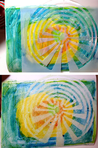
The shape the stencil left reminded me of a tree. I wanted some shimmer and applied a thin layer of Inka Gold with a palette knife. (Inka Gold dries super fast!!)
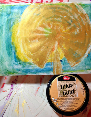
I don't have pictures of a few steps because I kinda got in the zone. But here's a rundown of what I did next: Using the stencil again I added a light layer of paint and then, when dry, traced the stencil with a black pen. I added a heart with the Ruby paint color and when that was dry I applied Liquid Glass to it to make it shine. It's my favorite detail! I used a gold Pitt pen to make five layers of dots around the "tree" (I repeated a favorite element from a previous card!) and a slight border of red. Love.

I hope this inspires you to make some cards yourself and send some sunshine to your loved ones' mailboxes! Happy Creating!
Leave a comment
Comments will be approved before showing up.

